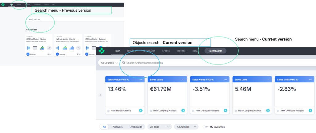
Try the renewed homepage, where you can follow your KPIs and search answers and liveboards, being able to filter the worksheet on which the object is built. The Search menu becomes the last tab, allowing data exploration on worksheets.

New Features
Search Menu
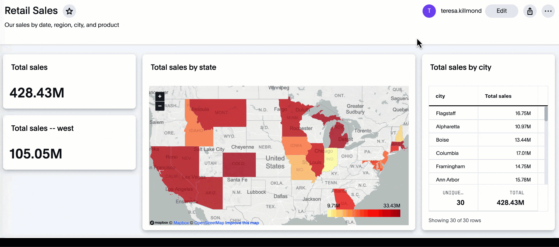
Liveboard cross filters
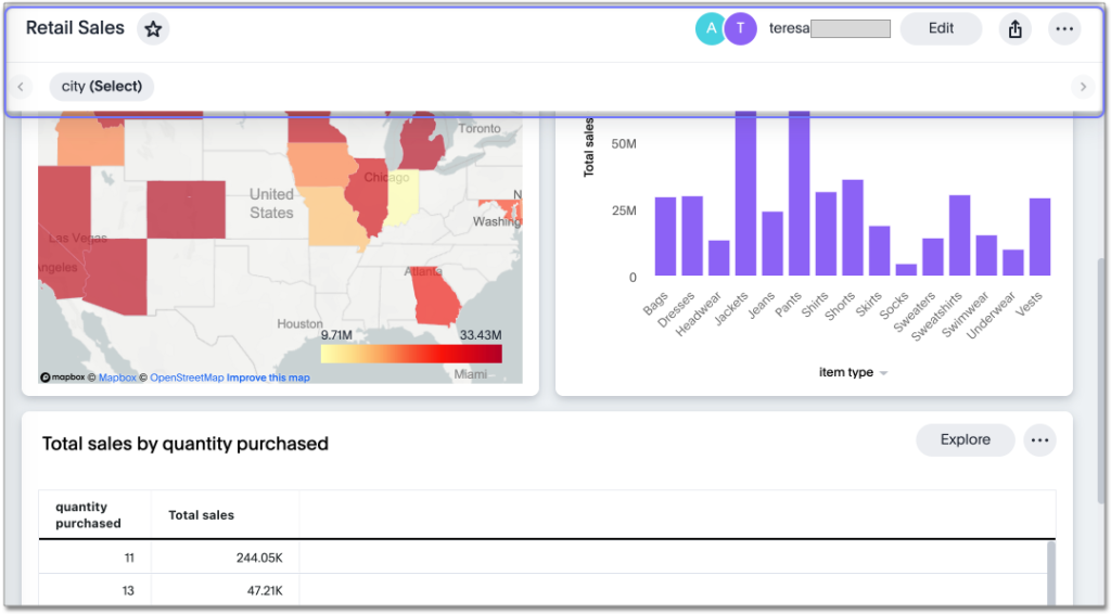
Right-click any data point in your Liveboard and easily filter the entire Liveboard by that value. For example, if you right-click California in a geo chart on your Liveboard, and then select Filter, all the other visualizations only show data from California. A visualization for Total sales by city, for example, would only show sales for cities in California
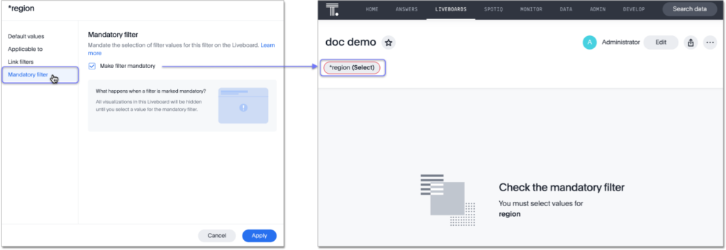
Mandatory Liveboard filters
Mark certain filters in your Liveboard as mandatory. If you add mandatory filters to a Liveboard, the visualizations will only load after Liveboard viewers select values for the mandatory filters
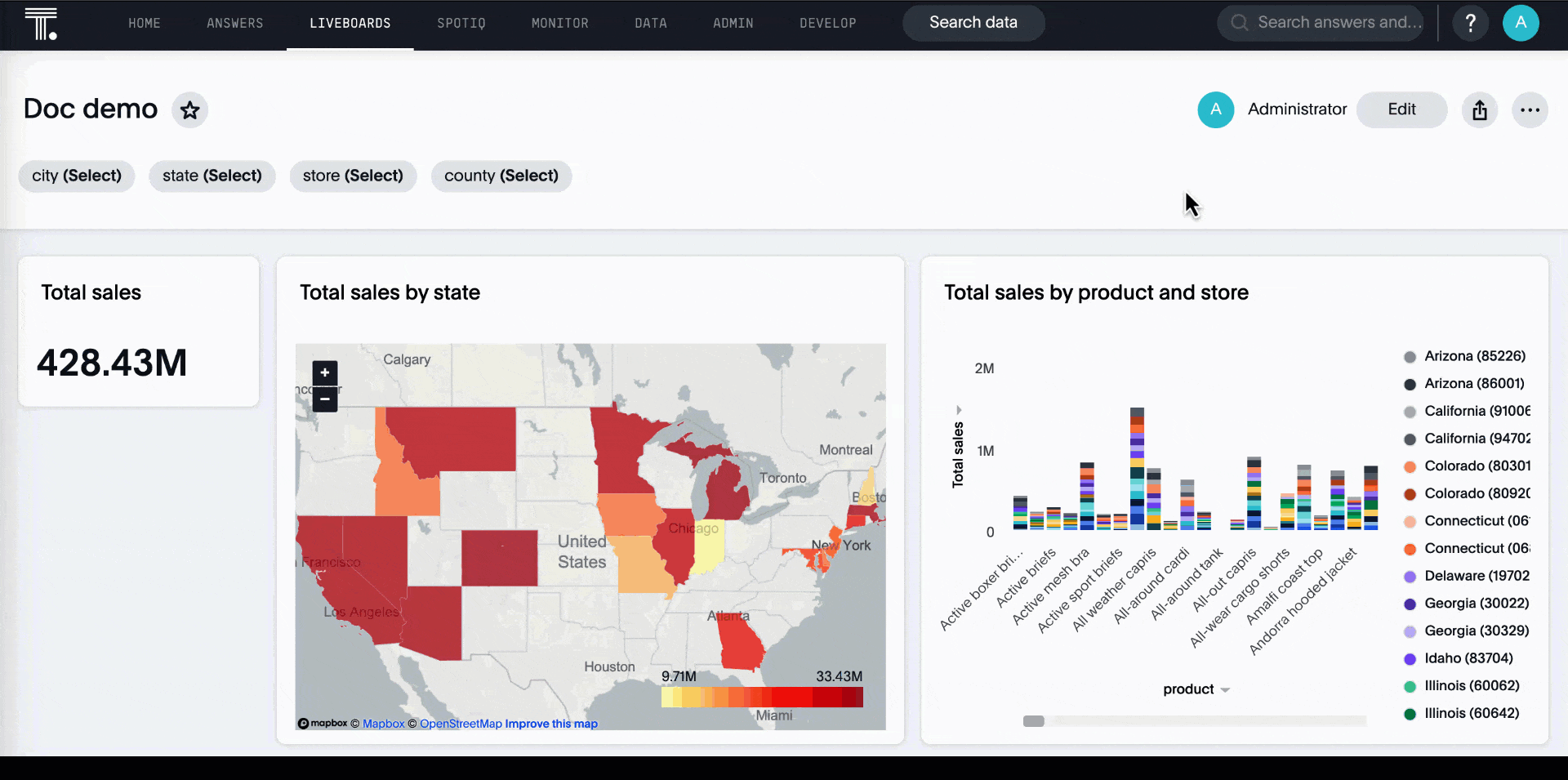
Change filter order for Liveboard filters
Arrange Liveboard filters in the filter bar so that they are in a logical, coherent order, by dragging and dropping them to different spots in the list. This makes it easier for viewers of the Liveboard to understand and use the filters on the Liveboard
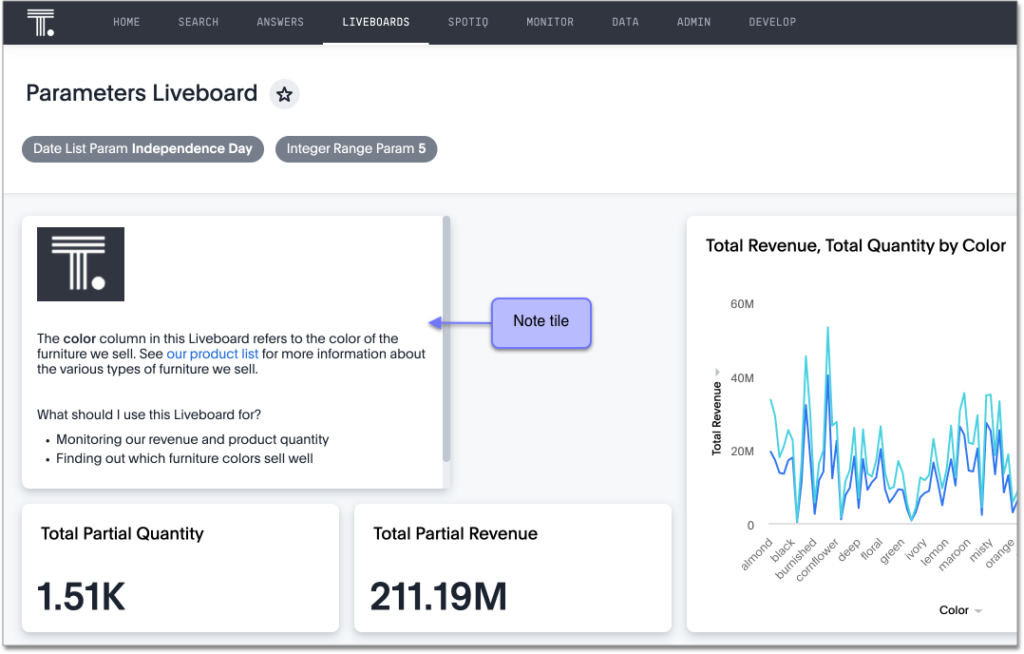
Liveboard note tiles
Add notes to your Liveboards, so that viewers of your Liveboards can quickly understand how to use the data and visualizations you gathered. Note tiles can provide an overview of a Liveboard or visualization, company branding through images, definitions of terms used in the Liveboard, and so on
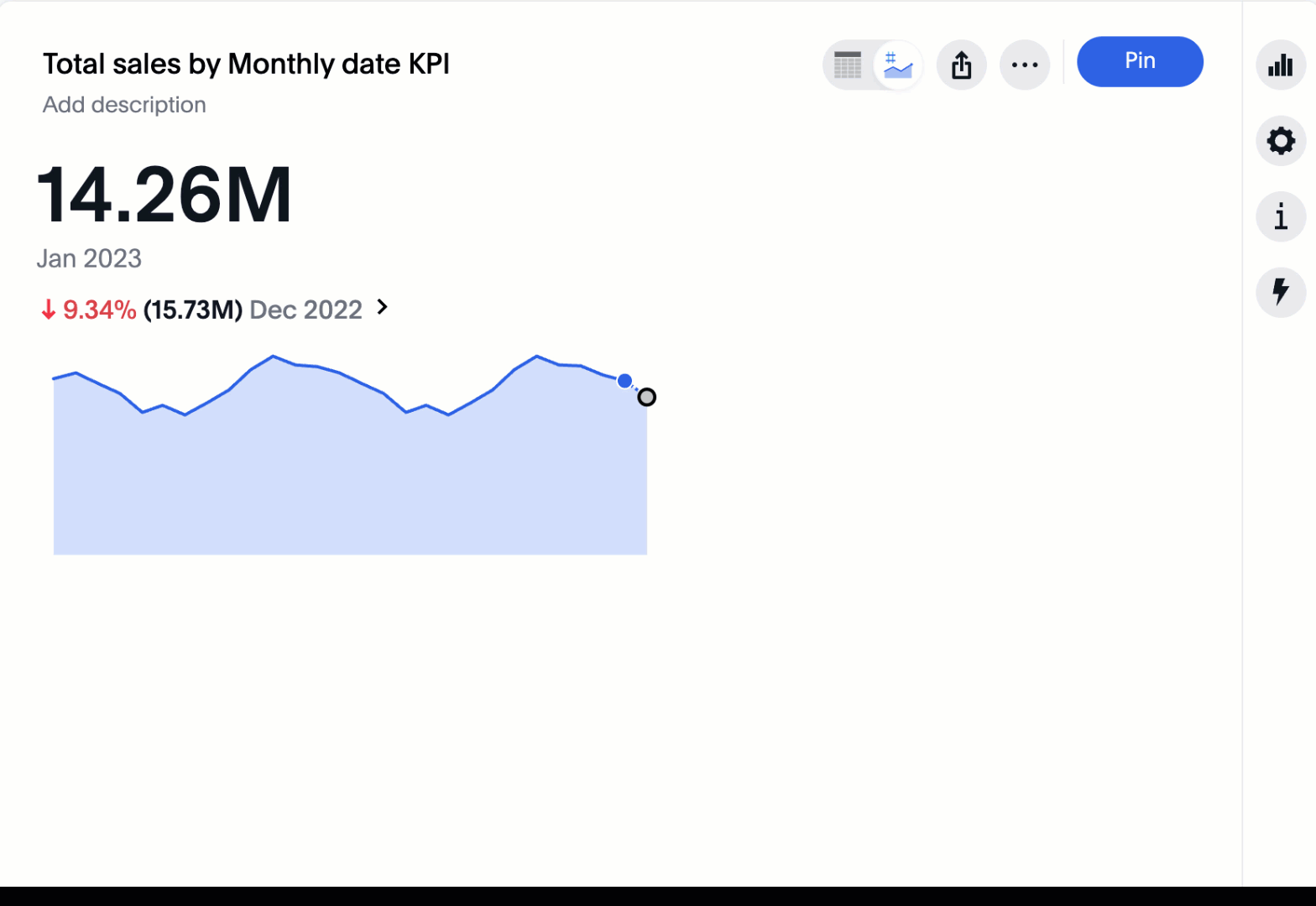
Custom comparison points for KPI charts
You can now set your KPI chart to display a percent change comparison between the most recent data point and a custom comparison point. For example, when searching for sales monthly, you can choose to see percent change between this month and the previous month, previous quarter, or previous year
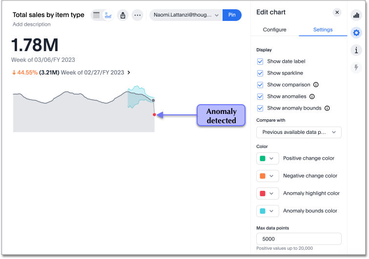
Anomaly detection for time-series KPI charts
You can now see anomalies in time-series KPI charts. Our new anomaly detection algorithm detects data which does not fall within the expected confidence intervals, while allowing for seasonal changes and growth over time
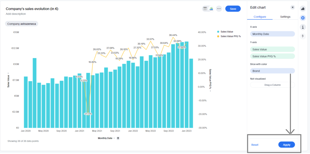
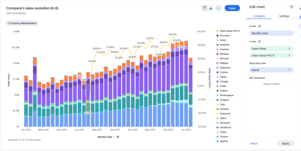
Apply multiple chart changes at once
When a user drags and drops the fields in the chart configuration panel, the chart reloads. When a user has multiple fields, they need to rearrange a lot of them to reach a desired chart. Now users can make multiple configurations, and apply them all at once, rather than waiting in between each configuration
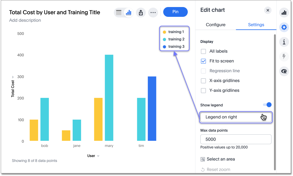
Ability to change legend position
You can now configure the legend position of a chart, or hide the legend. The available options are left, right, above, and below the visualization. To try it out, open the chart configuration menu, select Settings, and choose between Legend on right, Legend on left, Legend on top, and Legend on bottom. You can select the Show legend toggle to hide or show the legend.
Liveboard header visible when you scroll down
When you scroll down in a Liveboard, the Liveboard name, menu options, and filter and tab bars remain visible. You don’t need to scroll back up to the top to edit the Liveboard or check if you’re filtering by a specific store. You can see the filters or parameters applied to the Liveboard, select the Edit button or more options more options menu icon menu, and view which tab you’re on from any spot in the Liveboard.
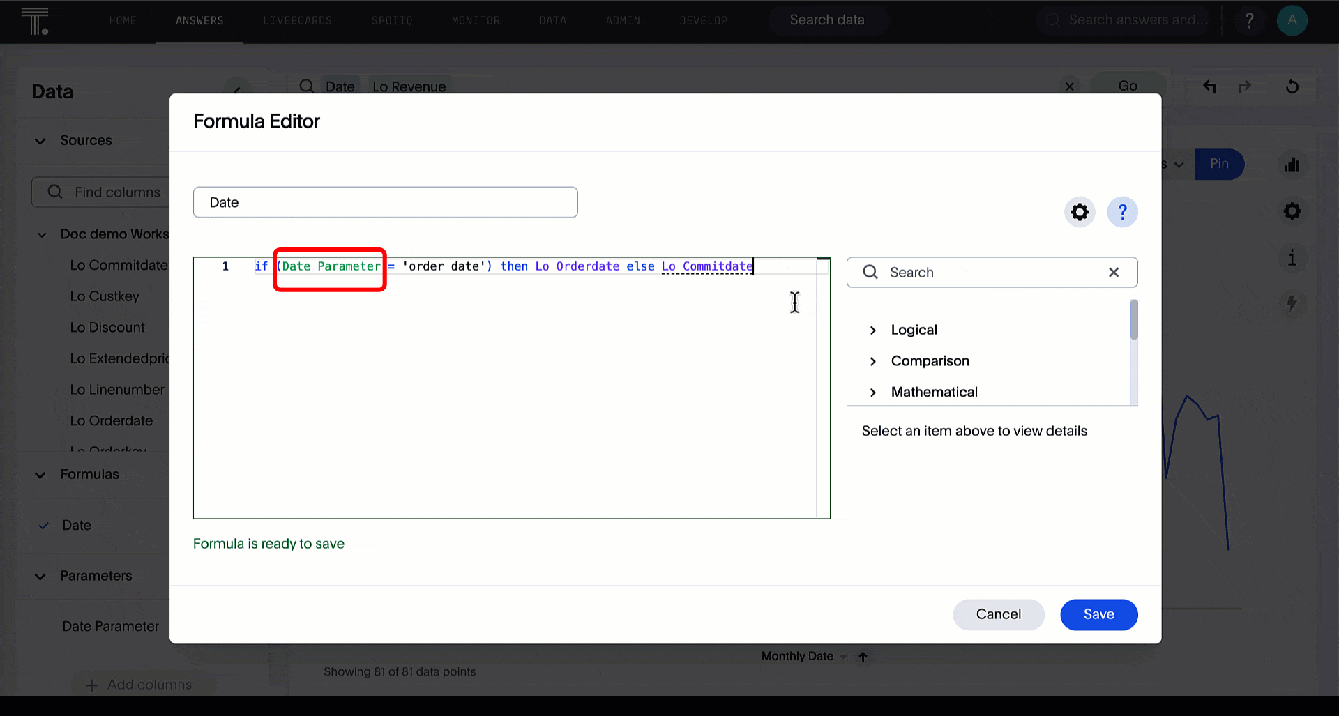
New Parameters feature
Optimize your data inquiries. Use Parameters to run different scenarios with adjustable values, without creating or modifying the constants in formulas for each new value. For example, easily adjust the attribute in an Answer to view your revenue by commit date or order date, as in the following gif:
Data labels on a dark background
Labels that appear on a dark background can be displayed in a lighter text color, making them easier to read
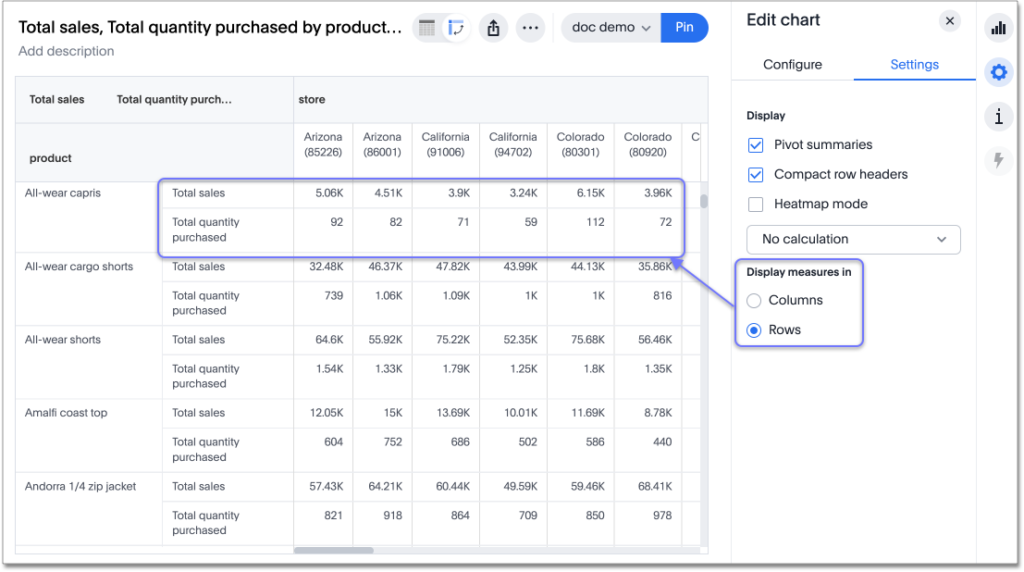
Show measures in pivot table rows
By default, ThoughtSpot displays measures in columns in pivot tables. With this release, choose whether to display measures in rows or columns in your pivot tables
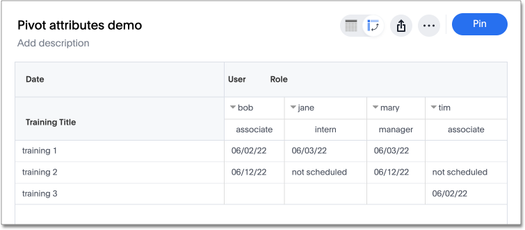
Allow attributes in pivot table cells
You can now include attributes in pivot table cells, as well as measures. This is useful for cases when you want to summarize text data such as user role, pass/fail, or other attributes.
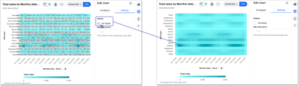
Disable heatmap data labels
Optionally disable heatmap charts’ data labels, and understand the chart quickly by scanning the heatmap colors. This makes complex heatmap charts with many data values easier to read